
This week has been all about red… red fabrics are what have been flying out the door!
Years ago there was a book “Blue and Yellow Don’t Make Green”, by Michael Wilcox. It is an amazing book that looks at how colors interact, and how light impacts what we see. And, one of the things that is talked about is how there are no pure primary colors, red, blue, and yellow in the man made world. They exist in the rainbox, and in nature, but, we can’t duplicate them. What it does talk about is how colors that we produce veer from the true primary color to one side or the other, toward one of the other primary colors.
There are many different color wheels which have different uses. But, the one we grew up with in school shows colors as absolutes.
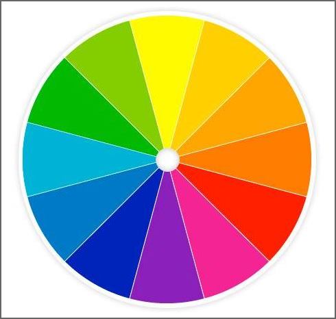
And, therein lies the problem. Color is gradient. The color strip shows it well.

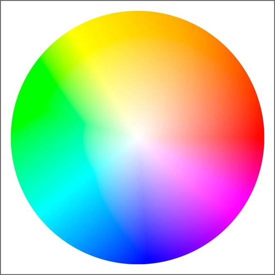
The gradient color wheel below gives different view of color.
For an interesting look at other color theory John Muir has an interesting article- I have notated it below.
So, what does this matter when buying fabric? To incorporate a fabric into a room, it is a good thing to be aware of. Does the red fabric you want veer to the blue or to the yellow? Is the red more violet or more orange? While one does not need to go crazy thinking about it, it is a helpful thing to be aware of when choosing colors and fabrics.
One of the reasons we want people to get samples is one can not judge color from a monitor- especially today when people have filters on some devices. Also, color is influenced by light and by what else is near it. It is really impossible to judge if a fabric will work in a room without viewing it in that space, where it is surrounded by colors and the light that will influence it.
Take a fabric down to the ocean where there is a lot of light and in Maine that fabric pales right out. It literally can look bleached out. The colors appear brighter, and deeper inland. Put a fabric in a dark room, and it will look different from it in a bright enviornment. How the eye perceives color is also influenced by the time of day. Our eyes and brain register more blue in the evening than in brighter times of the day.This is why I suggest that people hang a sample, so they can look at it over the course of several days to see how it looks in different situations.
But, back to fabrics!
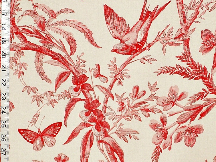
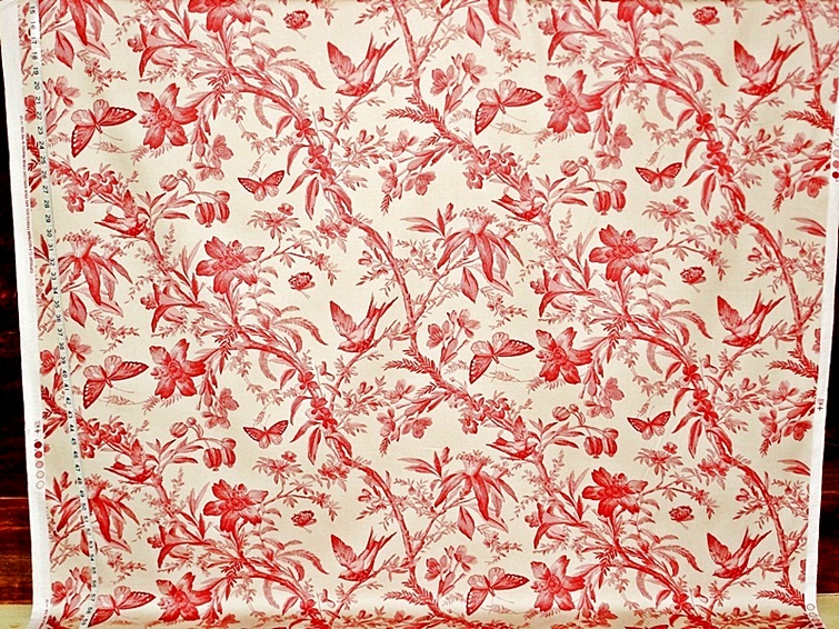
The most popular red fabric this week has been P.Kaufmann’s Aviary Toile in madder. This red toile has a floral garden with birds and butterflies. It is done in shades of red and salmon pink. A mid-weight home decorating fabric, it can be used for curtains, cushions, and duvets. It is a way to bring nature inside.
The Clarence House Chanderi is a very different fabric. It is a woven upholstery weight fabric, done with stylized paisley botehs laid out in rows.
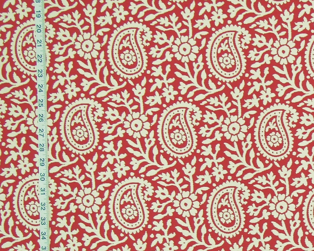
It is reversible. Use it red on white, or white on red, or do a mix of the two. This is a woven upholstery weight fabric. It can be used for upholstery work, bedspreads, or even curtains.
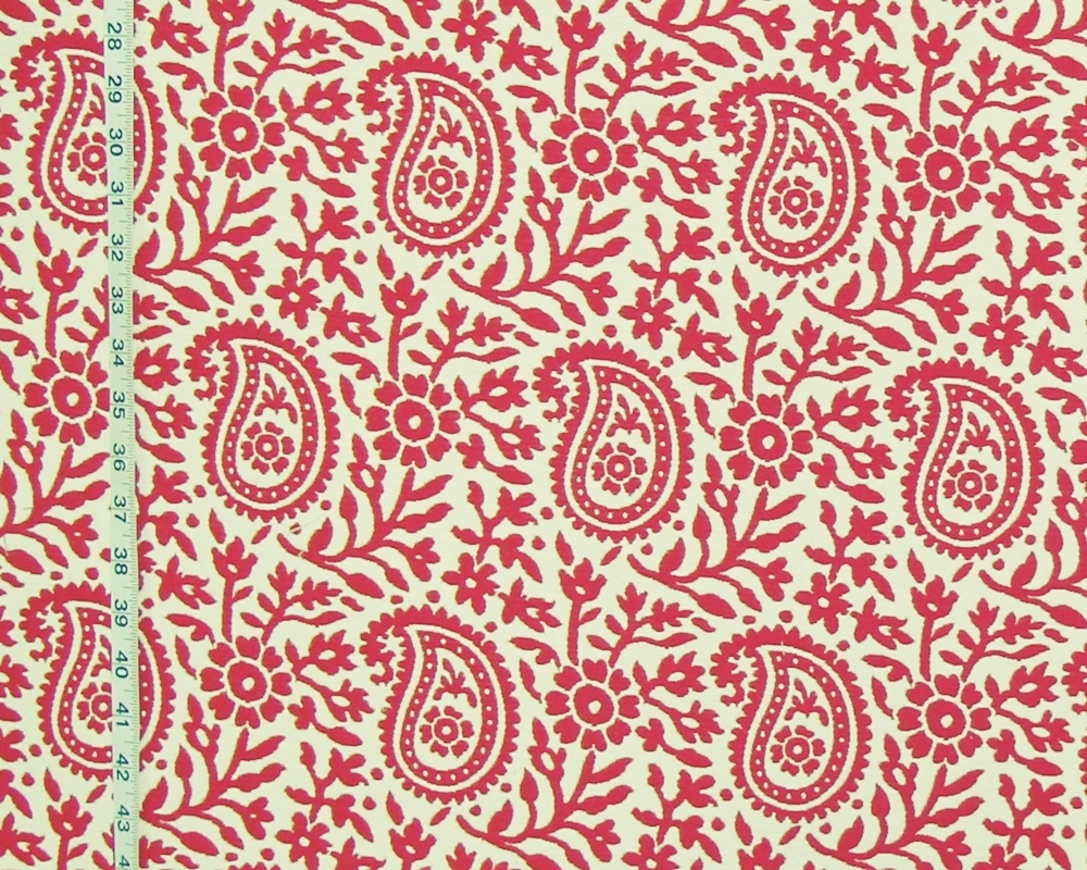
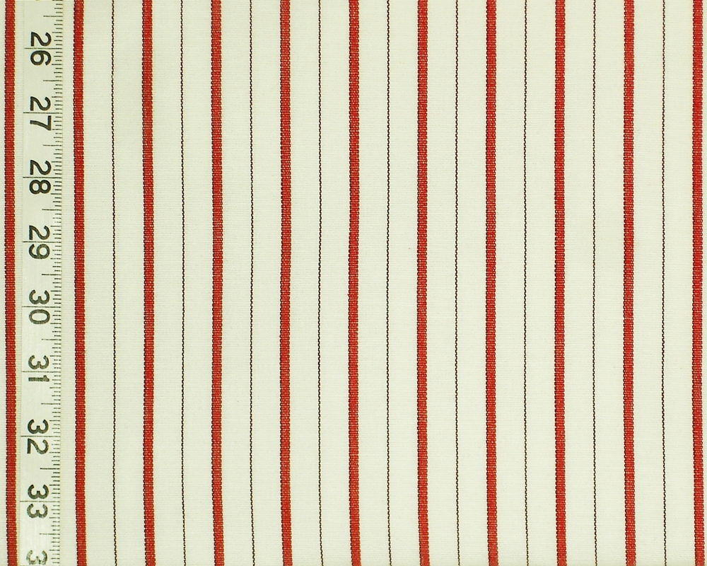
I was putting some samples together this week, and a piece of the red ticking stripe was on the table. While not a perfect match, it looked really good with the Chanderi. There isn’t much left, but the stripe juxtapositioned to the curving paisley forms worked really well.
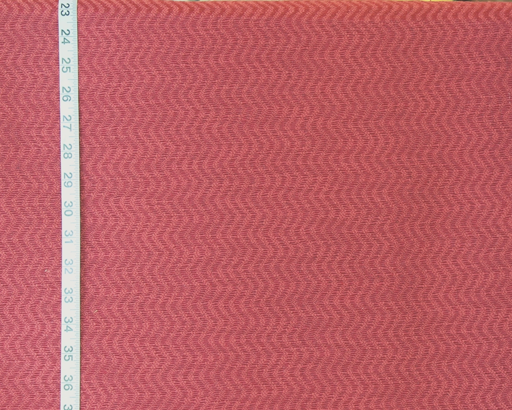
Another Clarence House Fabric that is red is the woven upholstery weight fabric, Salina. This is a tone on tone fabric with a lot of texture. There are two small pieces of it.
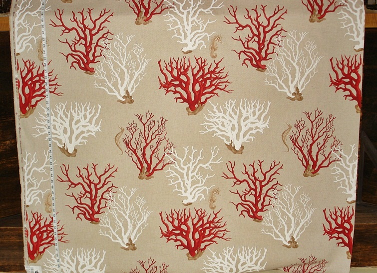
The third fabric that garnered a lot interest is the red coral seahorse fabric.
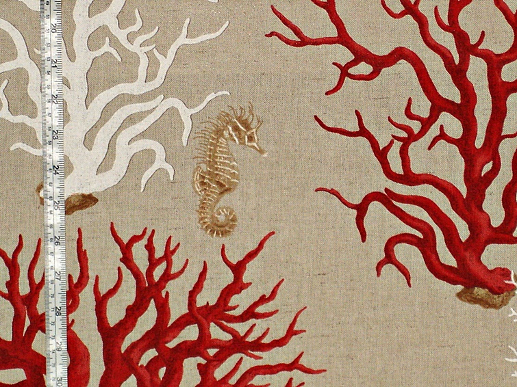
This is a mid-weight drapery fabric. It showcases two different seahorse among coral trees. It can be used for curtains, cushions, duvets, etc.
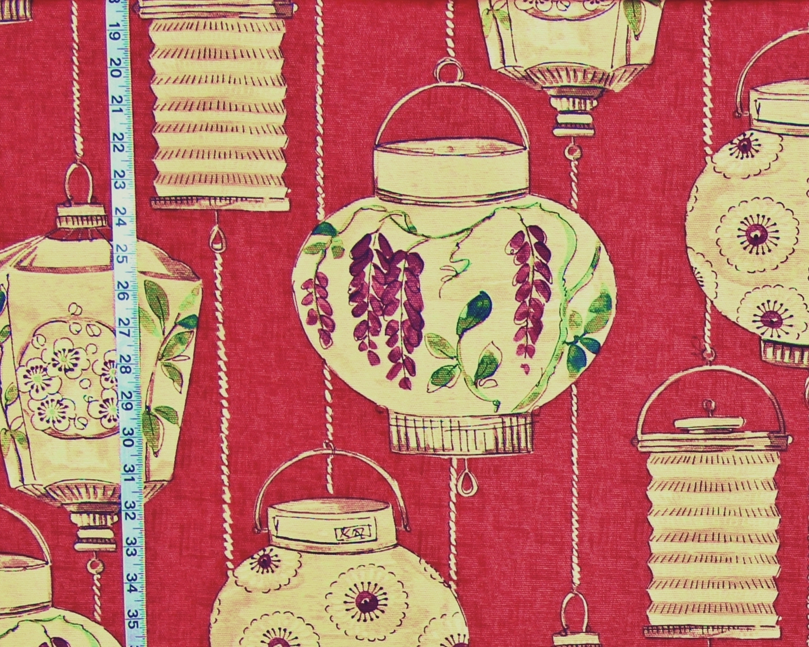
Another red fabric is the red Japanese lantern fabric. The background of this is tonal. There is a deep red applied over a lighter, brighter red with a salmon undertone. How this looks will vary depending on the light and what is around it.
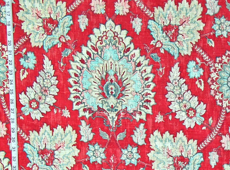
The red rug fabric also has a tonal background. Here the background colors are not as close in tone, and the layering is more defined. Again, the layering of the colors will have an impact on how we register the colors of the fabric.
I hope that thinking about colors and how we view them will help when considering whether a fabric might work in a room. I think it is important for us to understand what we want in our homes, what we are trying to achieve, and perhaps thinking about color will help us get there.
To see more red fabrics see the
Red Fabric category.
John Muir’s article about color is here: https://johnmuirlaws.com/color-theory/
_________________________________