
Neutral fabrics are a timeless way to decorate. Neutrals can add visual space to a room. Some add a calm, serene look, others are bold and add punch.
When approaching neutrals, it is important to remember that there are warm and cool neutral color palettes. Many companies produce both.
First one needs to decide what is one trying to achieve. If one lives in a hot, very sunny climate, one might want a cool neutral palette. If one lives were there is a lot of overcast or rainy days, one might opt for warm tones. So, the first step one needs to do is decide which is going to be used, warm or cool.
One thing about neutrals- they are highly influence by the environment they are in. They will appear more warm or cool, depending on what is around them- the angle of the sun, the colors of the walls, what is on the floor, and other things a person has in the same room.
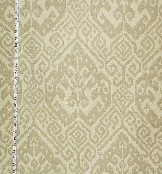
This neutral ikat can look brown, tan, taupe, or grey with beige, cream, or white, depending on the light and what is in the room with it.
There are neutral prints and wovens. If one wants an eclectic look, try mixing them. The wovens will add texture.
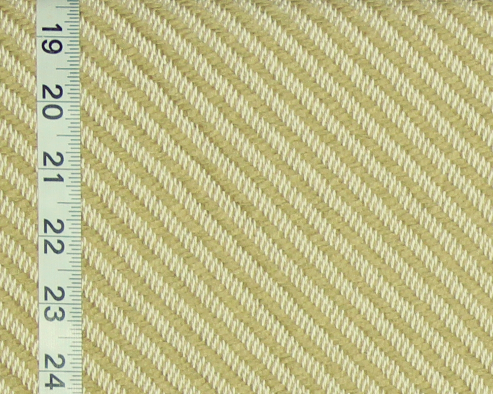
Clarence House’s Rimini with its raised horizontal threads, moving on the diagonal against a lighter background gives a lot of textural interest!
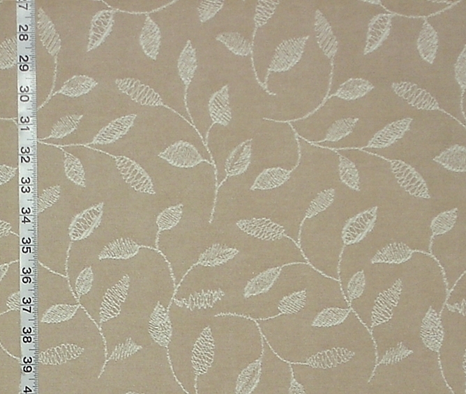
Embroidered fabrics also add texture.
Another way to add interest is to use reversible fabrics.
Paring the two sides can give a lot of visual interest.
There are fabrics that bridge both warm and cool tones. These fabrics can be really helpful! Say there were two fabrics that one really liked, but they just fight with each other in a room. This is where a fabric that uses both warm and cool tones can bridge the two, allowing one to use both together.
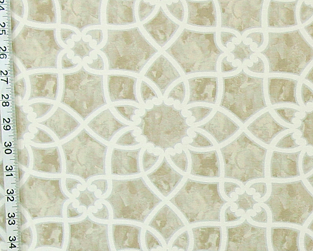
The brown, grey, and cream trellis combines both warm and cool neutral tones. The marbled background of warm and cool tones has a subtle contrast of grey outlining the warm cream trellis.
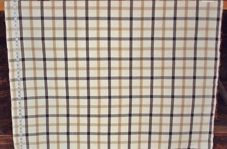
This madras windowpane plaid also combines warm and cool neutrals. A warm cream and a cool taupe get a boost from the black. Small tassels at the the intersections, add texture.
But, you say- I want some fun, interesting fabrics… well, nearly every category in the store has at least one neutral pattern that is fun or interesting.
Below are some of neutral fabrics to add interest and to showcase your interests as well!
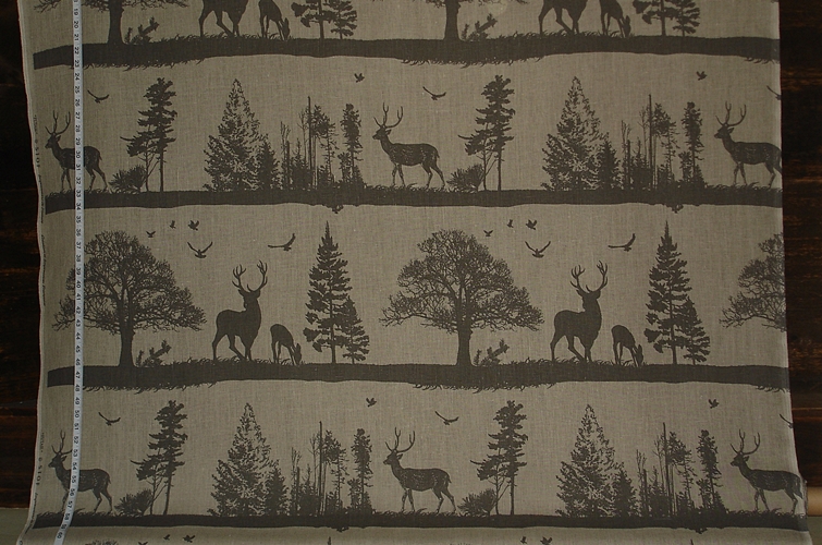
For those who need something with an outdoor feel
there is the linen deer fabric-
which is also available on white.
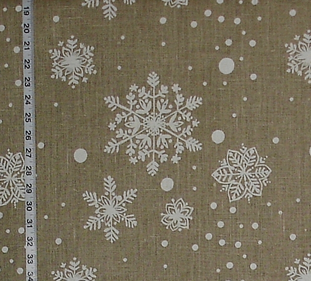
The linen snowflake is nice, as well!
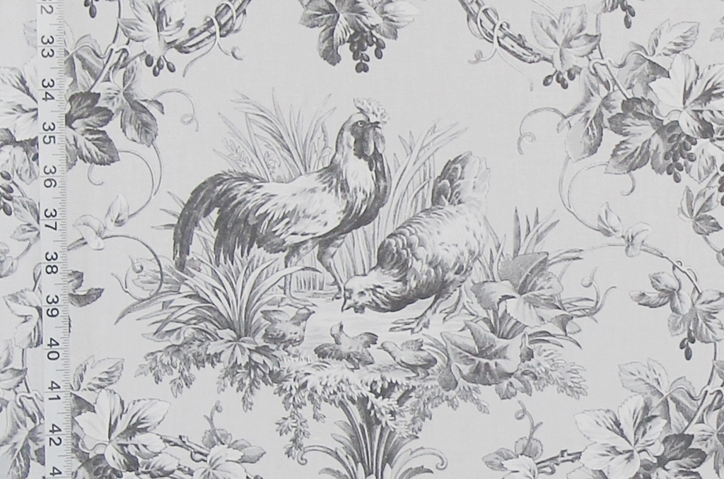
For those who like chickens!
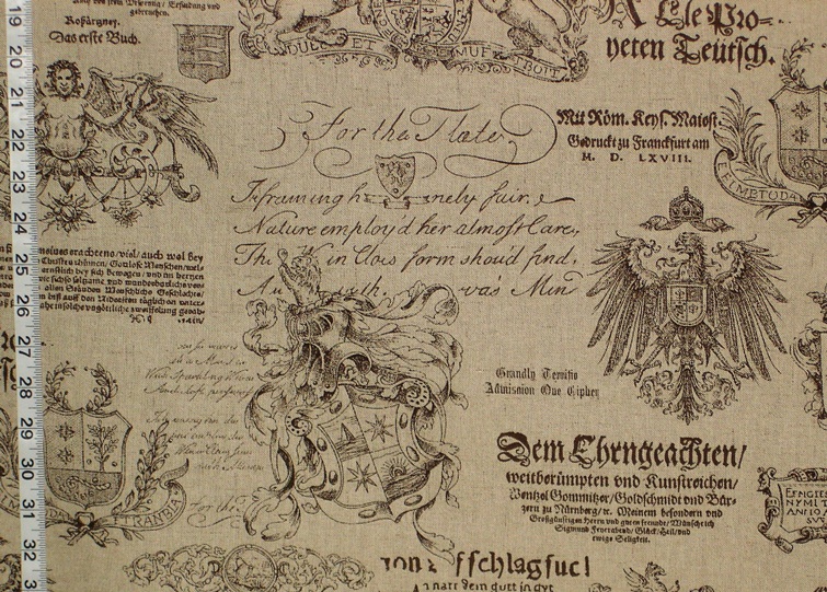
If one has an interest in anything Medieval,
the Germanic Medieval Fabric might be a thought.
It has a warm oatmeal background.
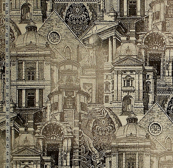
This architecture fabric is an intriguing blending of light and dark neutrals,
punctuated with black.
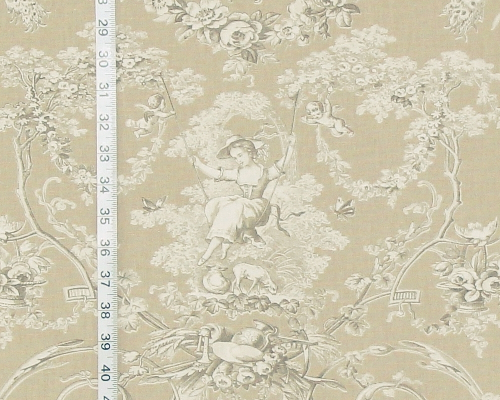
This toile fabric gives a traditional romantic look, in neutrals.
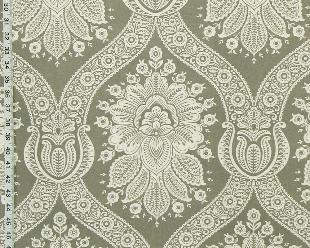
Also traditional, but with a high contrast and a crisp look,
is the grey colonial wall paper fabric.
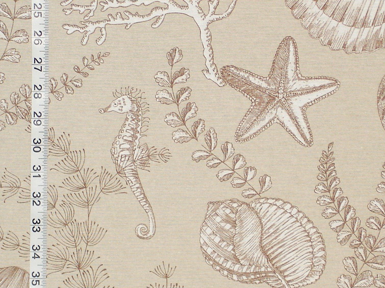
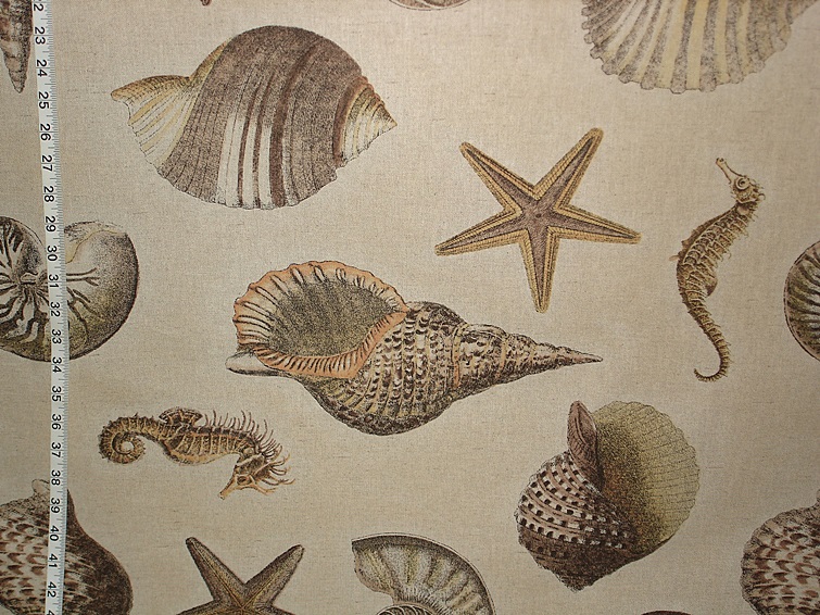
And yes, there are neutral ocean fabrics!
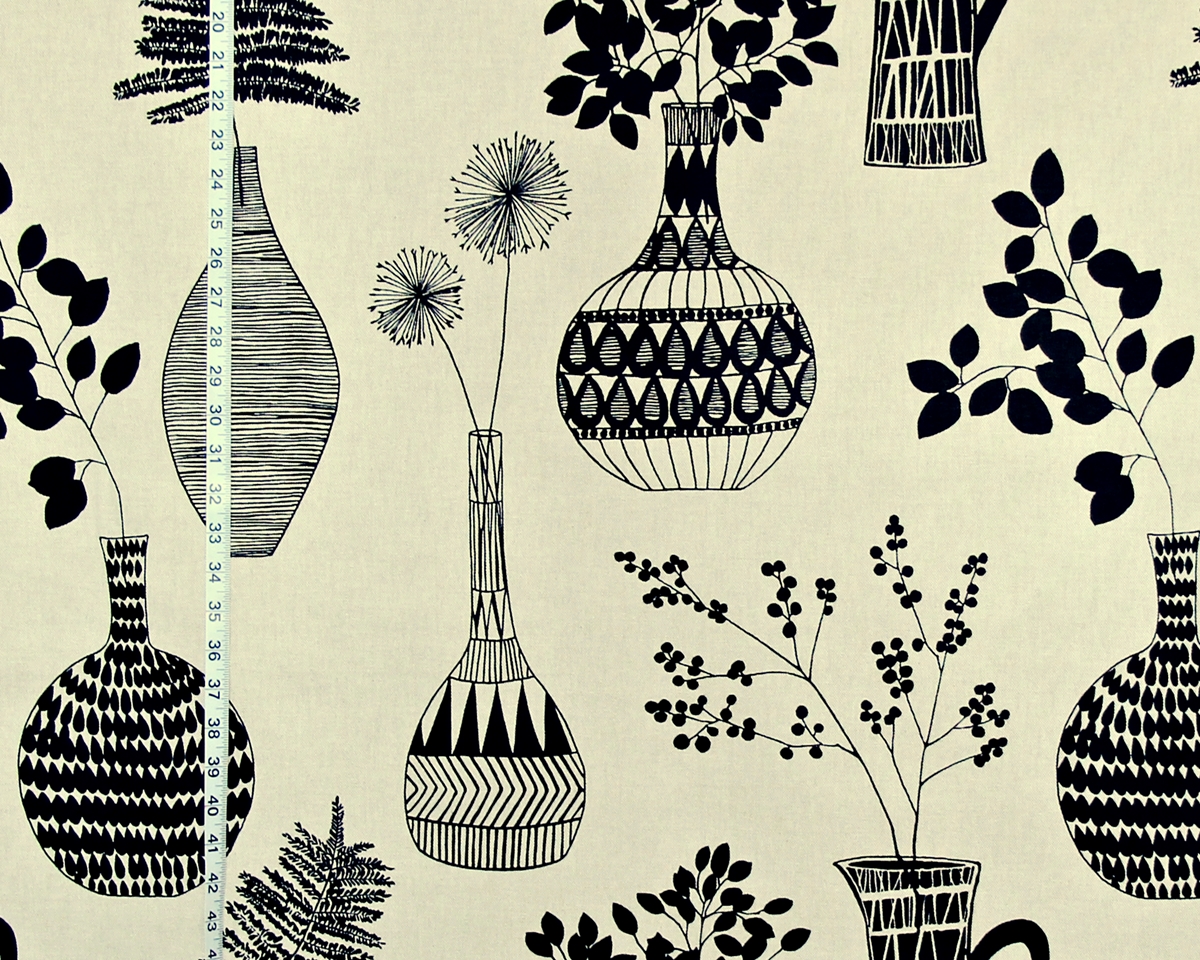
The mid-century floral fabric has a strong presence.
As one builds a neutral palette, one of the things to think about is what are you trying to achieve? What do you want to live with? Do you want just neutrals? Or will a small bit of color help pull it together with the room’s other interior decorating features?
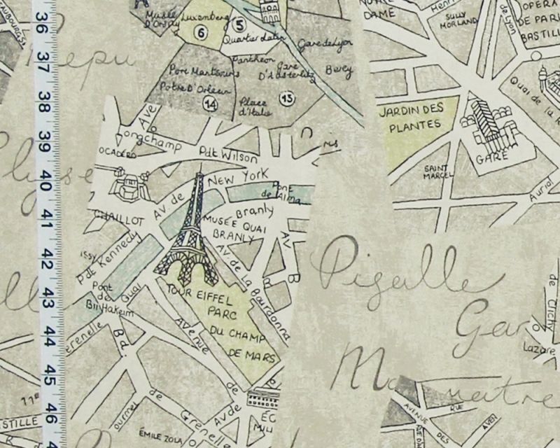
The map of Paris print has some subtle colors added-
watery blue and yellow add to a mostly neutral design.
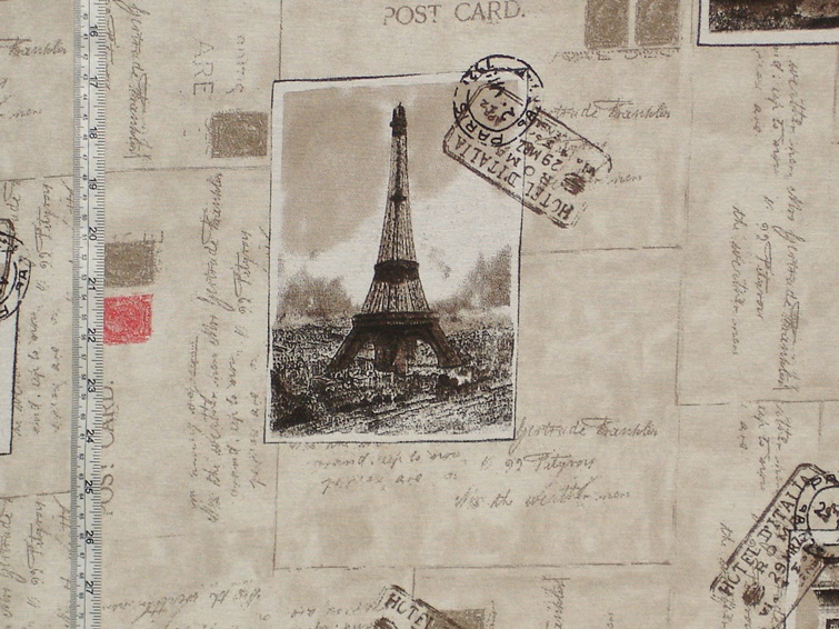
The Paris postcard fabric is neutrals with the punctuation of red.
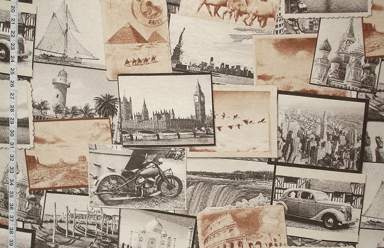
The sepia travel photograph fabric is done in neutrals with strong contrasts.
So, if you are redoing a room, step back…
Consider what you are keeping, what might be leaving,
and what you want to add.
And perhaps you want to work in a lot of neutral tones,
or maybe you just want to add a small amount to let what you already have shine.
To see our neutrals be sure to look in the
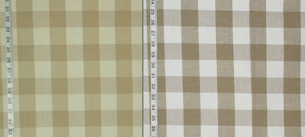
and for neutral checks and stripes see the
_______________________________________