
The last ten days have been all about neutrals.
But, what is interesting is
it has been the light colored neutrals
that have caught peoples’ interest.
And, the one’s that have had the most interest,
whether a woven or a print,
have been those that don’t have high contrast.
These are fabrics that don’t have a high
“wow” factor,
but have a subtle, understated elegance.
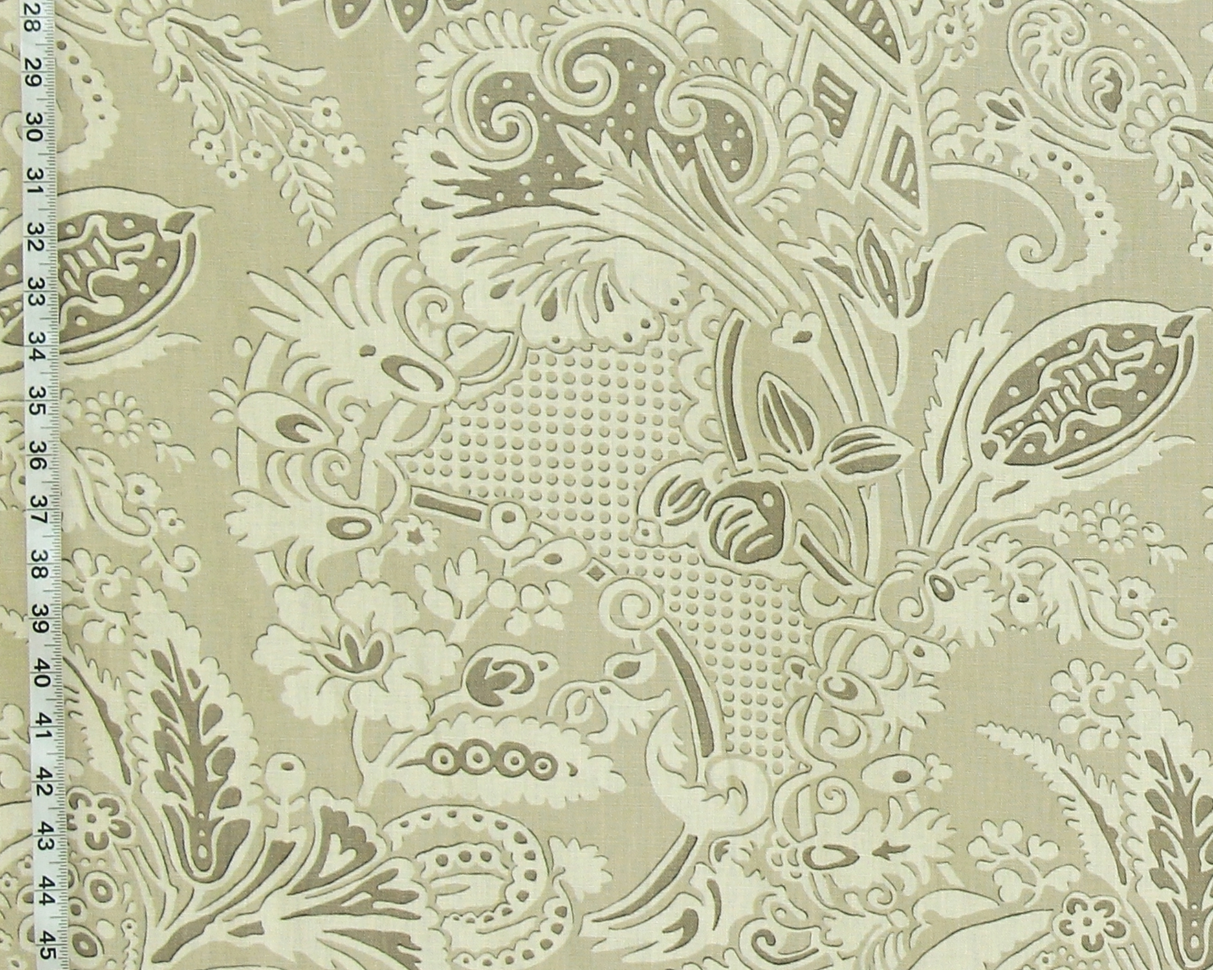
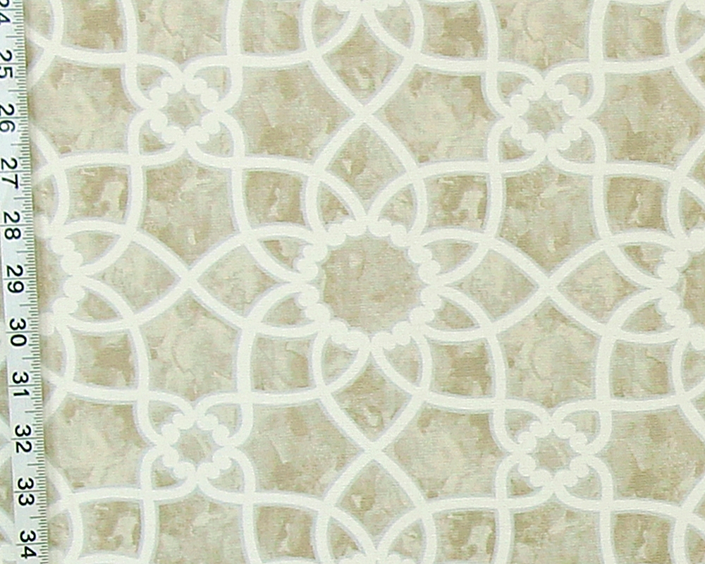
The Clarence House Fabric Rosina,
is a printed fabric with a mid-century look.
It is done in shades of brown with cream.
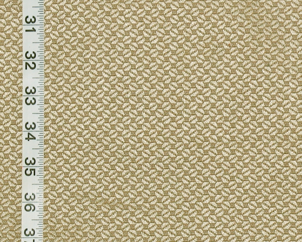
With the Clarence House Fabric Kona,
it is all about the weave.
This upholstery weight fabric
has a silvery beige and pale brown coloring,
with a small woven in pattern.
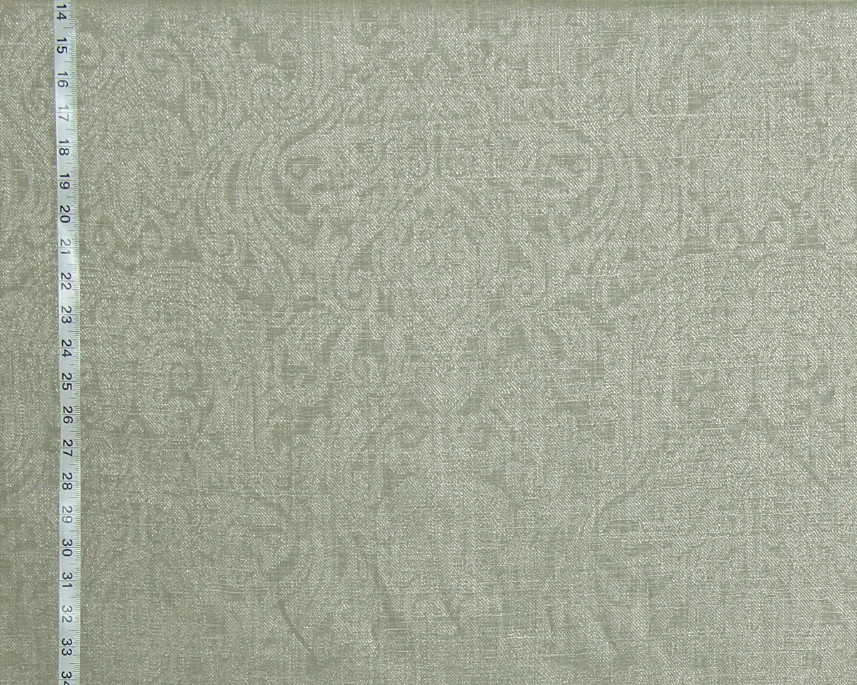
Moving into the grey neutral tones,
the Clarence House Fabric Ghent
has a tone on tone pattern,
that has an almost medieval feel.
Though a woven fabric,
it does have drape and can be used for both
draperies and for upholstery.
The woven lattice fabric is available in both
a grey and a tan.
But, the grey has less contrast than the tan one.
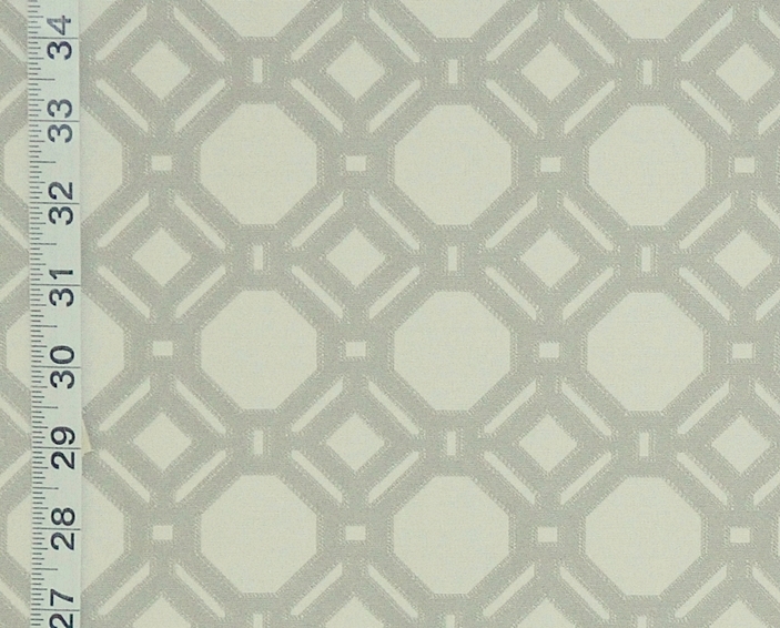
Conversely the printed grey lattice fabric
has more contrast that the brown colorway.
While we do have more pale neutral fabrics
they tend to have a higher contrast.
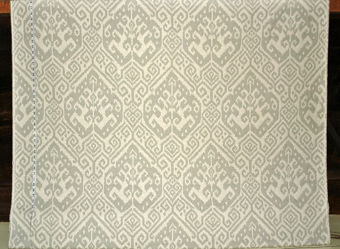
The grey green ikat is an example for this.
We do have quite a few neutral fabrics.
See them in the
Beige and Tan Fabric category.
________________________________________