
Orange is an interesting color.
I think it is one of those colors that one either is attracted to or repelled by, when used for home decorating. I really don’t know anyone who is indifferent to it- who could take it or leave it-when used for that purpose.
So, it is interesting.
The color’s name, orange, is taken from the fruit. And, while people may not wish to live with orange in their home, it does have a unique use as a symbol. The actual color is tied to both religions and politics. In some religions orange is the color of purity, and in politics orange has been associated with specific political factions- Ireland and Holland spring to mind.
Orange is also associated with fall- pumpkins, leaves, and of course, blaze orange for outdoor clothing.
________________________________
So, what is orange?
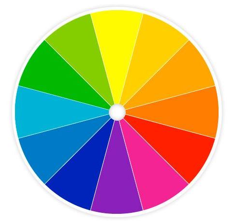
Orange is a color, that can be seen when the dominant spectrum of light is between 585 and 620 nanometers, it rests between red and yellow in a rainbow. And, in traditional color theory is produced by mixing red and yellow, two primary colors, making it a secondary color, opposite on a color wheel to the primary color of blue.
The orange produced by mixing the red and yellow will vary in tone depending on how much of each of the red and yellow is used. That said, there aren’t any pure primary colors in the man made world, and the red and yellow will also have an overtone. With the red it might have a bluer or more orange cast; and the yellow could have either a more green or orange tone as well. Any of these will influence the tone of the orange. Secondary colors that move toward one of the primary colors on either side of it, form another color, which are called tertiary colors.
In this case the primary colors used to make orange are red and yellow, orange being the secondary color. And the tertiary colors associated with orange are yellow-orange and red-orange.
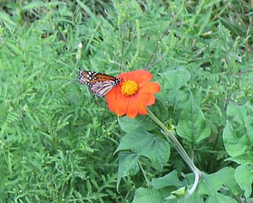
There is a lot of orange color in our world. Oranges, naturally! But, carrots, pumpkins, as well as other fruits and vegetables. We see it in many flowers as well. Below is a monarch butterfly on tithonia- two oranges!
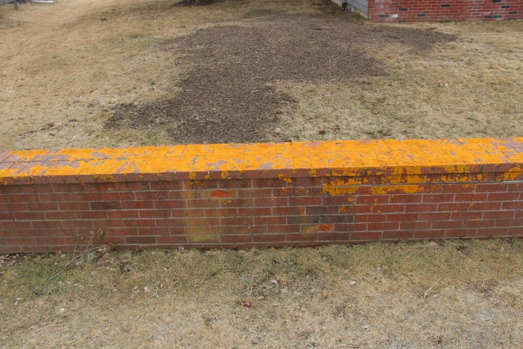
A blaze of orange lichen is not forgotten!
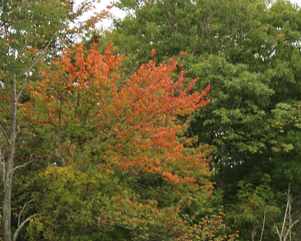
And, of course New England falls are full of orange!
But, back to fabric.
As we know, how our brain interprets color is based on quite a few factors. First, it comes down to the rods and cones in our eyes. But the number of each and also their placement, as well as their age matters. This is why when I see orange someone else may argue that no, it is more red than orange. We all see color differently due to our eyes. And, we all interpret the color waves that we see differently, as our brains are all different.
Other things that influence color is the time of day. For instance we do see more of the blue spectrum in the evening than in mid-day. And, of course there are other factors. Take a color and look at it in natural light, and then look at it again in artifical light. They will not appear the same. This also applies to things like your actual location. Put a fabric in a room down by the ocean, and then look at it inland- the fabric will look totally different depending on the difference of the light values between those places. A fabric in coastal Oregon with the amount of cloud cover that is there will not look the same in a home either up on a mountain, or in Eastern Oregon.
The color of the fabric will also appear different depending on what is around it. Colors do influence how we see other colors!
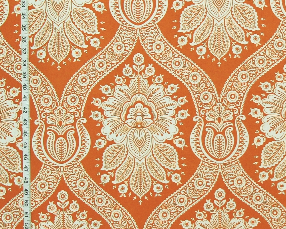
In the orange colonial fabric we see white on an orange background.
Partially due to the printing, and partially due to the pattern,
the look is clean and crisp, orderly.
It has a strong presence and makes a strong statement.
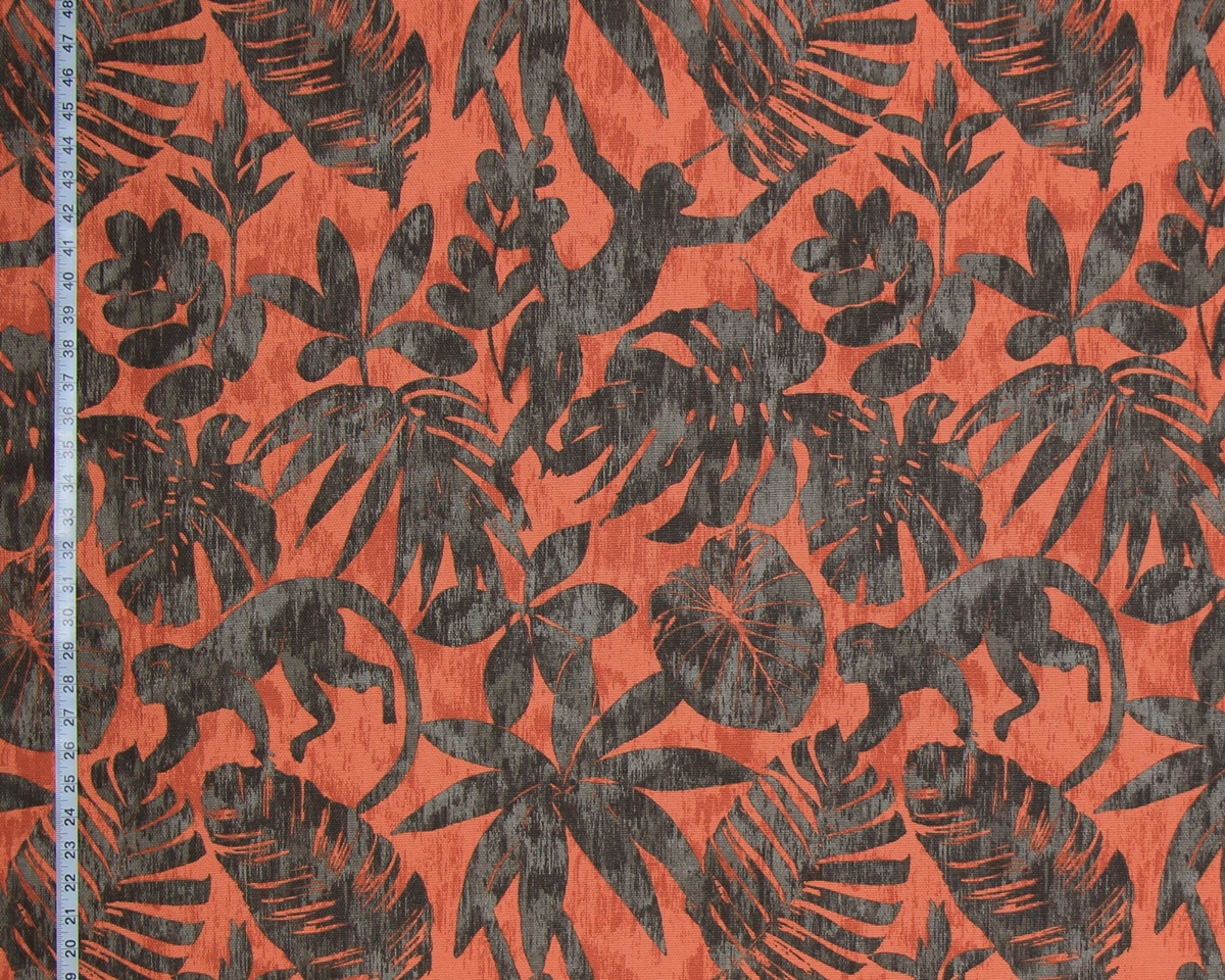
The monkey silhouette fabric is almost the opposite of the
colonial floral.
Here is an orange background,
but with a dark pattern overlay.
Both the orange and the dark brown grey
are done as a strie,
which blends the colors.
The lighter milky color softens the orange tones,
while the light grey and dark brown,
not being related in color,
are much less blended.
There is a high contrast between the
pattern and the background.
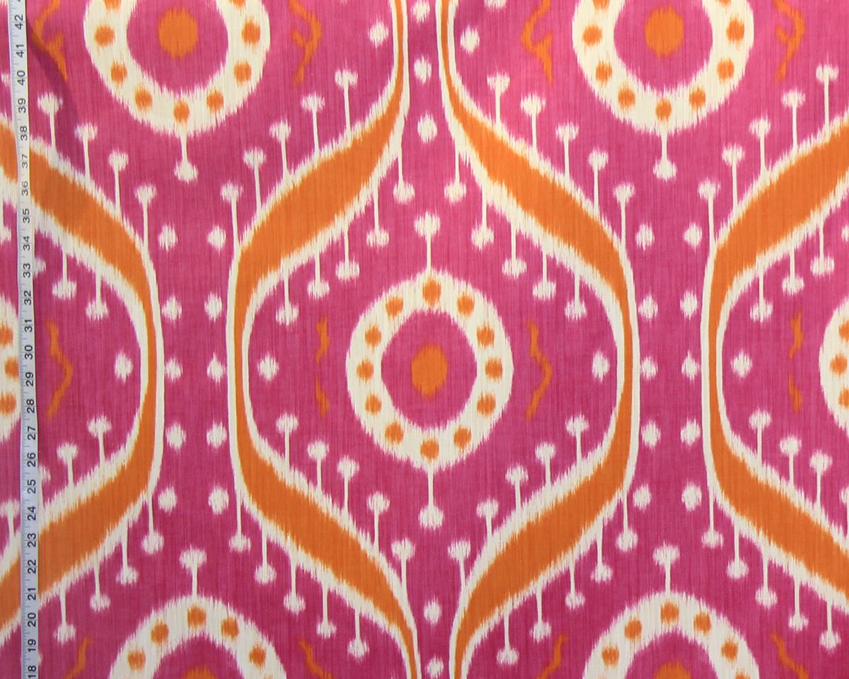
The Clarence House fabric Tagore
uses orange as an adjuct
tone for strong fuchsia.
With the use of two such powerful colors one would think they would pop.
But, if one looks at the orange details in the field of fucshia,
they don’t.
They are so close in value that they really aren’t that noticable.
Two steps away from each other on the color wheel,
these two colors make a statement only by separating them with white.
They need a strong contrast between them to really be seen.
It is the use of the white that really makes this pop.
I think this fabric gives a valuable lesson in the use of colors,
and in the use of white.
In the ethnic rug pattern orange is used totally differently.
It is one of many colors that are close in tone:
orange, brick, and rose wood.
Gold and tan are used to round out the color palette.
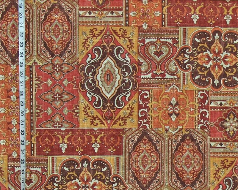
The colors are tonal,
which give them a vintage look.
But, the total would be bland without the use of
dark brown and white.
The dark brown grounds this pattern,
the white punctuates it.
Each color is separate and distinct;
not only is there no blending of the colors.
but it is the actual pattern of the fabric which
keeps each design,
and hence each color separate.
One thing about this,
even though the pattern has a lot of different elements,
there is an orderliness to this fabric.
it is actually a calm design.
The architecture fabric also uses many colors .
But, it is totally different.
Here each color is used as a bridge to the other colors used.
They are ombred and move from true colors, to shaded tones,
and then move into another color.
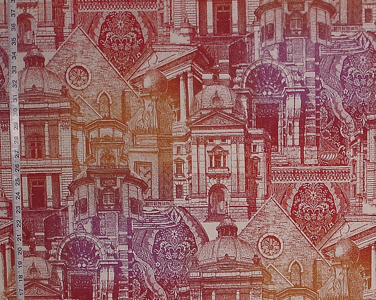
On the other end of the spectrum from the blended colors and
busy pattern of the architectural fabric is the
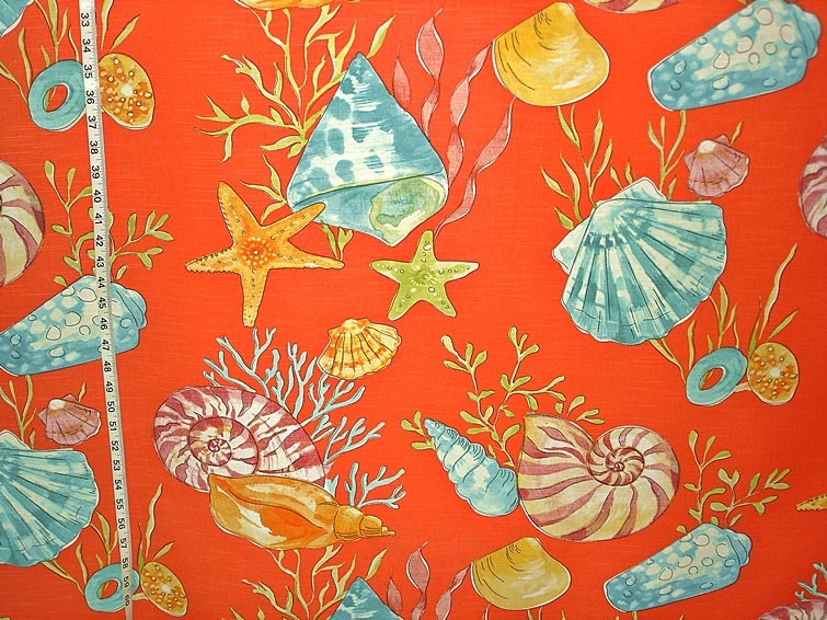
orange seashell fabric.
Almost simplistic in design,
its simple forms,
with muted tonal coloring,
allows the strong solid clear orange background to sing!
While not for everyone,
in the right place where one needs a strong statement,
with a whimsical feel,
this might work.
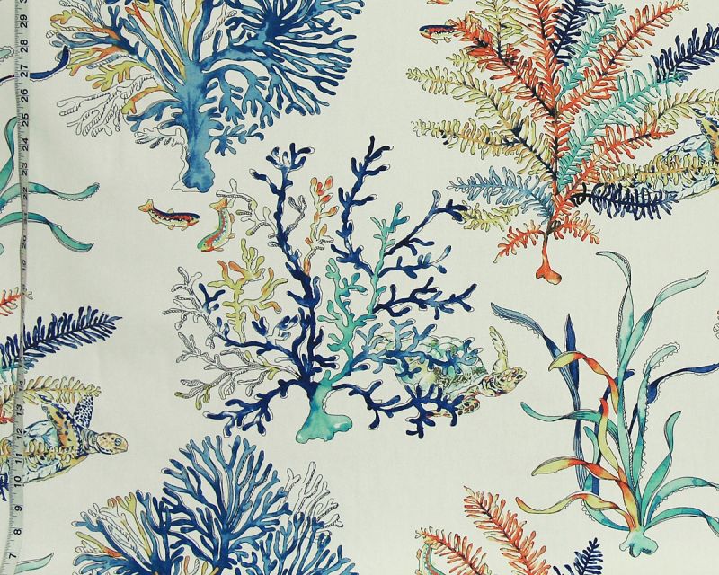
One often sees fabrics with orange tones paired with blues.
The reason is they are opposite on the color wheel,
and opposites tend to work well together!
An orange fabric can enhance a decorating scheme.
On the blue coral turtle fabric,
orange is used to enhance the pattern,
giving depth.
Here you have many blues and aqua,
while orange is the accent.
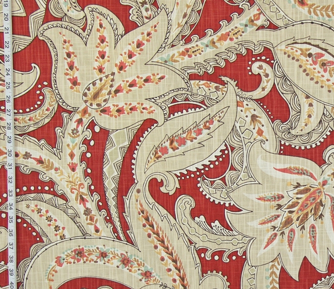
On the orange teal aqua paisley fabric,
orange is the dominant color,
but is used as the background,
and the blues are the accents tones,
used for the pattern.
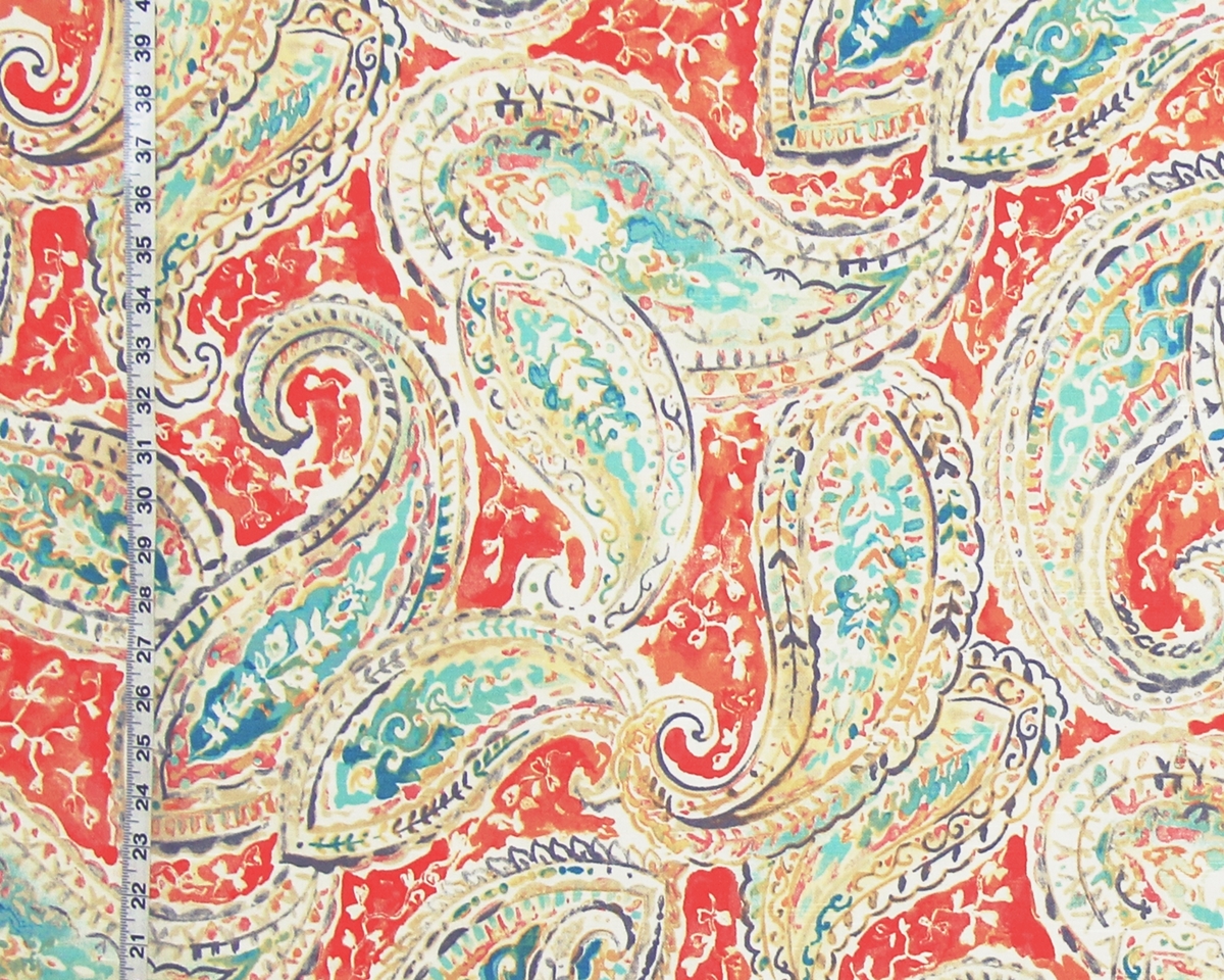
Here all colors are tonal,
and have a watercolor effect.
Golden tan tones, with white, are used to soften the strong tones,
and pink adds additional interest.
The use of the small white pattern on the orange background,
helps to unify and bridge the design elements.
This is a large scale pattern,
with a whimsical feel.
Both the scale, pattern, and coloring
give this an exuberant fun feeling.
Another fabric that uses the same tones in a
totally different manner is the
Orange Indienne fabric.
Here the orange is a strong brick color used as the background.
Muted gold, tan, and white are the used for the pattern,
with pink and soft blue being the accent tones.
The dark outlining of the pattern is what keeps this looking crisp.
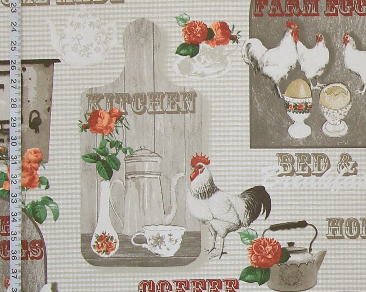
The retro chicken fabric uses orange to give pop to
an otherwise bland palette.
There are a lot of ways to use color and pattern. When looking at fabric, step back from it. Really look at pattern placement, and color placement. Ask yourself what you see, what is it saying to you, is it something you even like. These are all things a person needs to do for themselves and their surroundings.
A small detail that niggles at one at first, will be the first thing one focuses on when one looks at the fabric once it is in place.
Can you use that pop of color? Does it do what you want? The whole point is for a person to enjoy their surroundings. So, think about the balance of color and pattern needed in your home.
And yes,
a small bit of the right orange
might be what is needed!
To see more orange fabrics see the
_________________________________________